Design & Style
-
Posted: September 13, 2015Categories: Design & StyleRead more »
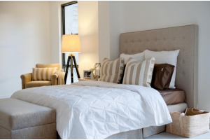
Creating visual delight in the bedroom is all about creating rhythm and flow.
The bedroom is a place of nuance, suggestion, the perfect setting for rhythm - the gentle art of design.
Rhythm is rarely accidental: while your eyes roam easily over the visual landscape of your bedroom - flowing from one element to the next, delighting in what you see - this effect is created, nurtured into being by the careful placement of well-chosen furnishings.
We've selected some ideas to help you create a rhythmic bedroom that will find you relaxing … sensing… experiencing… the sacred flow that makes for divine bedrooms.
Repetition
The use of repetition really enhances flow, encouraging our eyes along its pathway.
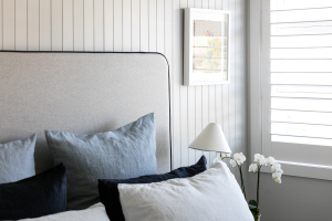
You could choose to use similar fabrics, perhaps for your bedhead, otto and chair, to create a sense of connectedness, a natural rhythm to your room.
-
Posted: August 09, 2015Categories: Design & StyleRead more »
Choosing the perfect bed and bedhead is an important decision. More than just getting the 'right look' in the bedroom, we need to be able to find within its walls a place of relaxation and retreat. An element of depth and moodiness are also desirable in the boudoir.
The Drama of Contrast
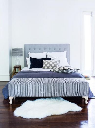
While you may have visions of soft pastels and gentle flowing shapes, the careful use of contrast can help create a depth of dramatic intensity that adds to the moodiness of your perfect bedroom.
Contrast helps to spice things up; to create interest; to take us away from a sense of uniformity that may make the bedroom too formal – and boring!
Contrast can also be used to help define the focal point of your room, drawing attention towards the heart of the bedroom… the bed.
Contrast can be achieved by adding different colours, shapes and even divergent textures to your room.
-
Posted: July 22, 2015Categories: Design & StyleRead more »
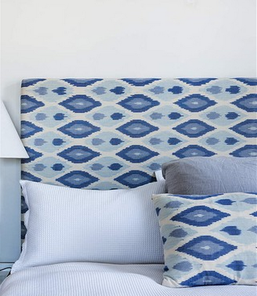
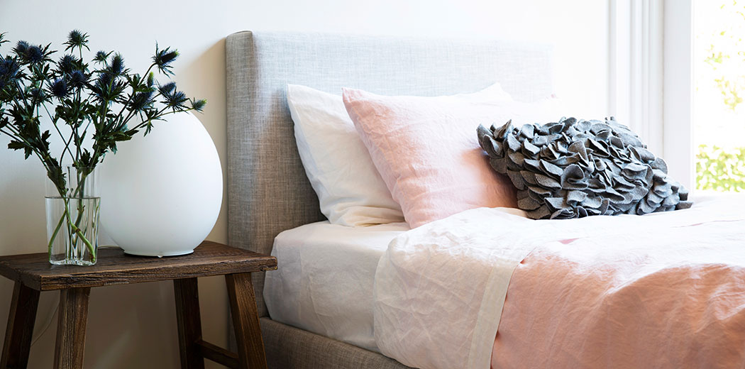
Our bedrooms are our sanctuary; the place where we retreat from the demands of life; a place to relax and rejuvenate; our own private space for romance and the restorative act of sleeping. We spend almost half of our lives in our bedrooms and so they deserve our very best attention.
While it may be tempting to save the luxury and comfort for the more public spaces of the home, treating yourself to a beautiful bedroom is a way of honouring yourself, your own personal needs.
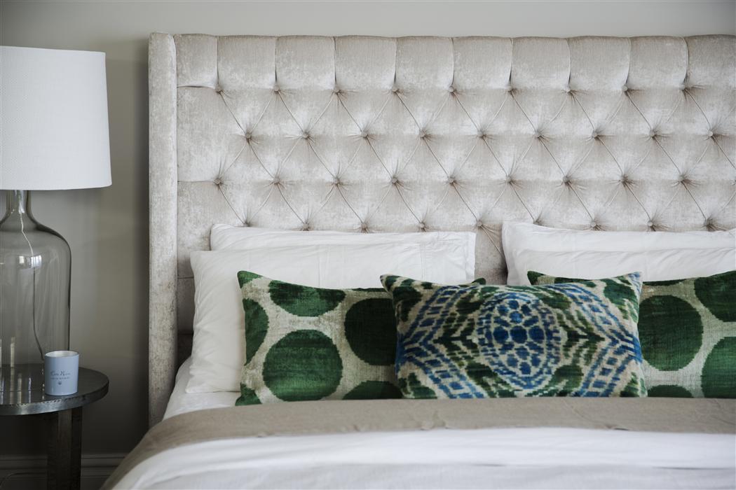
Bedroom décor, more than any other, should reflect your individual taste and style and create an ambiance where you feel truly relaxed.
With some tender care and attention our bedrooms can become our nests, our special nurturing space. That’s why choosing a bedhead or bed is such a personal (and important choice).
-
Posted: January 25, 2015Categories: Design & StyleRead more »
I’ve been intrigued by these light fixtures with their insect-like arms for oh, well, forever really. I’m sure you recognize them. They pop up all of the time in stylish interiors - and with good reason! Captivating, sculptural (and so utterly divine in their under-stated beauty...) they are the timeless work of 50s design icon Serge Mouille.
I love the fact that Mouille never succumbed to mass production (despite the huge demand for his work). He made all of his lamps by hand which probably accounts for their rather organic-like and expressive feel. With their tentacle like “spider” arms, they look more like pieces of art than a light source….and they probably look just as good now as they did when they were first launched – absolutely timeless don’t you think?
-
Posted: November 02, 2014Categories: Design & StyleRead more »
Polish it, mould it, paint it or leave it raw and exposed, concrete has definitely made a transition from simple utilitarian building material to a sort after (and dare I say swoon-worthy) medium for interiors.
Concrete looks especially good with bricks, glass and metal (for an edgy industrial look) but it can hold a real warmness too when paired with organic materials like wood and leather. With its neutral grey tones and fabulous texture (plus the fact it can be molded into pretty much any shape!) it’s not surprising that we are seeing a real movement in concrete home accessories (think sinks, tables, pendant lights, planters and vases). It’s become so much more than a building material….here’s some concrete inspiration on a Tuesday morning:
I just love this space. Exposed brick, Hans Wegner chairs and that beautiful polished concrete floor...sigh...
-
Posted: October 26, 2014Categories: Design & StyleRead more »
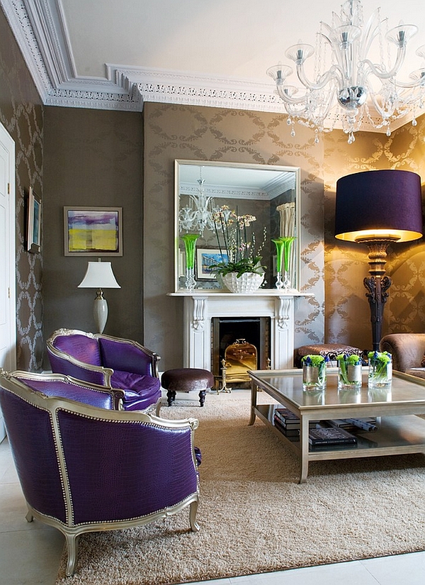
Lighting has hit the big time….BIG in an Alice in Wonderland kind of way - super-sized pendants, jumbo floor and table lamps as well as big exposed light bulbs. Oversized and bold they challenge our sense of scale and throw any sort of rule on proportionality out the window!
I do love this play on proportions though – a bit whimsical, a bit fun and maybe even a bit bonkers (in a good way). It’s not just about lighting a space, these bold beauties create visual excitement and a touch of the unexpected - a great choice if you are looking for an over the top style statement. Mmmmm, I’m starting to think that big is indeed better….take a peek at these!
No twee Victoriana here, despite it’s traditional design, the sheer size of the floor lamp gives the room a modern edge -
-
Posted: October 05, 2014Categories: Design & StyleRead more »
Looking around my house, let’s just say “bombsite” springs to mind. It’s the end of school holidays (ahhh now you understand…) and while I love having my little one’s home together (I really do!), it’s been pretty busy, hectic and full-on. Alas, no sign of a domestic goddess in this household.
My home is probably best described as “cheery” domestic chaos where school bags, toys, scooters and all things children-related seem to rule. I do dream of what it would be like to live in a neat and clutter free home though (oh the joy of having things stay where you actually put them…). After a busy holiday period, I had to share these pics – they’ve helped me “step” into a lovely calm space to start my working week. Enjoy!
This white on white interior makes for a nice dreamy escape –
-
Posted: August 31, 2014Categories: Design & StyleRead more »
Maths may not be for everyone….but we’re all happily enjoying geometrics! They are just fun don’t you think? Amazing how a bunch of triangles can get us all so excited. I love the way geometric pattern hovers somewhere between 60s retro and futuristic. Put them anywhere - they work just as well in a baby’s nursery as they do in an opulent bedroom.
Polyhedrons, hexagons and triangles to zigzags, chevrons and circles, geometric pattern can be added in a subtle way or big and bold (there are some amazing geo print wallpaper’s out there...) adding a real punch to any space. The beauty of geometric pattern is that it can be mixed and matched with loads of styles from industrial to contemporary chic. Just take a look at these pics...
The wallpaper is the star of this room with the geometric pattern giving a real energetic buzz to the space -
-
Posted: June 01, 2014Categories: Design & StyleRead more »
I’m giving my hallway some interior love - it’s been crying out for attention (it’s a bit of a dumping ground for shoes, coats, bags…. hey, I do have kids!) but now it’s getting a makeover, an overhaul, the whole shebang. We are doing up the staircase, ripping up carpet, repainting walls and laying down a new (and might I add very gorgeous) runner. The hallway is going to be an amazing space...
Hallways are often the most neglected room in the house. It’s usually narrow (which can be a challenge) but it’s still a room that needs some love. You can have loads of fun with hallways – a bold wallpaper or paint it in a dramatic hue, hang a striking light fixture, create a gallery wall, lay an eye-catching hall runner. If space allows it, gorgeous seating or a console table by the door (handy too!). Or you can just keep it minimal and uncluttered,
-
Posted: May 25, 2014Categories: Design & StyleRead more »
I’ve always considered myself a bit of a plain and simple kind of girl but lately I’ve really fallen in love with pattern – and what a time to fall in love! There are gorgeous patterns everywhere - ikat, chevron, trellis, stripe, damask, floral, toil, animal print, polka dot, graphic. Bright and colourful or soft and subdued. Riding solo or mixed up craziness. Rules are being broken and caution thrown into the wind – a pattern play is going on that is pure perfection! Oh my…
Mixing patterns definitely brings a sense of playfulness to a space. Busy patterns up energy levels while simple or pale patterns can create serenity. The art of pattern mixing can be a bit daunting (I hear you!) but hopefully the below pics will give you some inspiration - don't forget you can always abandon the “rules” and just have some fun. You’d be surprised

